RC Cola
Case Study | 2016 Repositioning
concept | branding
Project Description
Research on a brand that will benefit from repositioning. Create a proposition for such brand, including its new look.
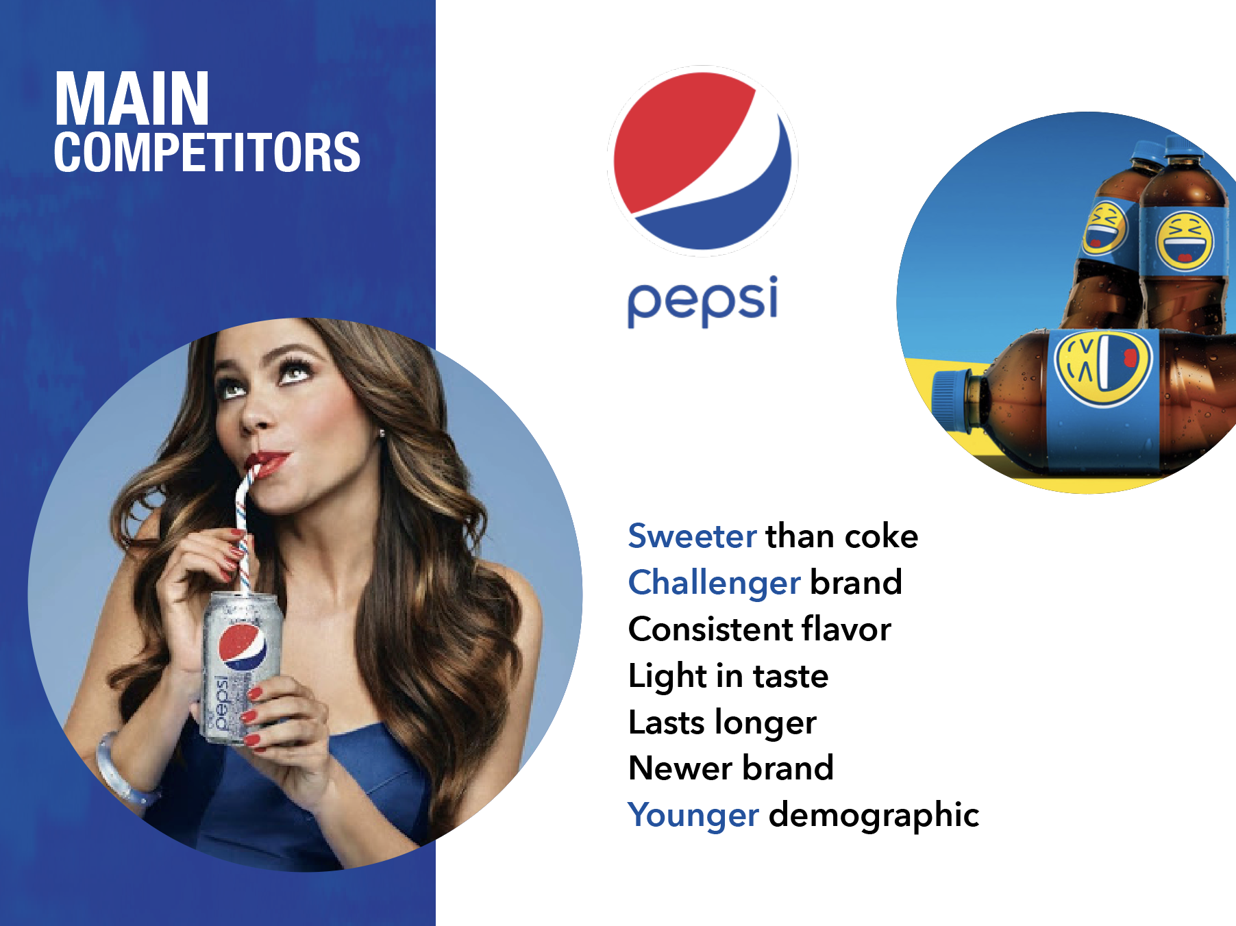
Problem
RC Cola is a brand with 100+ years in the market. However, due to the strong competitors like Coca Cola and Pepsi, it has not been able to position itself and make a name of its own. It is a brand with a low awareness level.
Opportunity
There are very strong players with high awareness and market share. However, there is a market most sodas haven’t focused on: sodas as mixers for alcoholic beverages.
Challenge
The soda market is tough to compete on. RC Cola needs to look for ways to stand out, to either target a different market or become a product with a different selling point.
Strategy
Make RC Cola the primary soda for mixing. Bring a sense of luxury and sophistication into the soda market by creating associations with a variety of high end drinks. The brand refracts perceptions up, allowing for higher prices.
Research, Insight and Current Look


Key Points for Repositioning
Lack of premium/sophisticated sodas in the market
Less accessibility, therefore making it more exclusive
Cocktails and alcoholic beverages use mixers, and Royal Crown can rebrand itself to become the “soda that doesn’t ruin an expensive drink”.
The Brand Elements
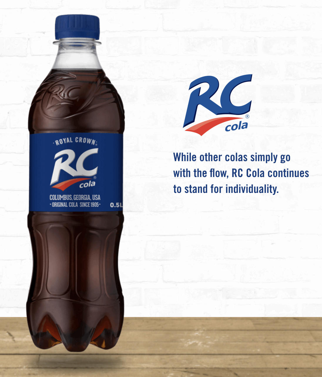
Logo
The logo of the new RC Cola, mixes luxurious lines and unique characters to represent individuality and sophistication. The Crown is also used as a symbol of premium, while it has a hidden symbolism. When looked upside down, the crown becomes the cap of the soda.

Colors
The main two colors are gold and dark blue. These, in combination with the logo create a sense of richness and luxury.
The logo, when possible, is plated by a layer of gold foil with a textured blue background. If not available, then the logo will be as shown above.
Typography
Used for “RC Cola” logo, Exodus gives the brand a more sophisticated look. The serif typeface has very unique designs like the space in the top of the letter C, as well as the mix of serif ends and pointy ends. Under special circumstances, Exodus is used for title text.
Butler Medium is used for essential text. The Serif Typeface creates harmony with the logo, and maintains a sense of luxury.
Pier Sans is the primary display typeface used for paragraph format, or any large body of text. It is used in the bottle (for nutritional information and ingredients) to allow for easy readability, and to contrast both Exodus and Butler Medium. It complements the serif typefaces and creates balance.


The Bottle
To differentiate it from the rest of the sodas and bring the level of luxury, RC Cola’s bottles are made of a dark tinted glass. The shape of the bottle resembles those of liquor products, not only to showcase how elevated the brand is from the rest of the sodas, but also to make it feel harmonious at the bars, and stores when compared to alcoholic beverages. The idea is to make RC Cola belong to a more upscale atmosphere.


The Cocktail Booklet
The bottle is accompanied by a small booklet that hangs from the neck of the bottle. The booklet has different recipes that utilize RC Cola as a mixer to show the consumer some possibilities. In the last page of the booklet, the website is displayed as a call of action, where consumers can explore more recipes and usages of RC Cola.

Bottle and Booklet Display
The booklet will be attached to the bottle by a thin gold rope.


Brand Association and Selling Points
The idea is to market RC Cola as a luxurious soda. By creating partnerships with alcoholic brands such as Johnnie Walker, while also choosing strategic selling points such as W Hotels, RC Cola is able to build a brand image of premium and sophistication that will make it stand out in the soda market.