Behance
Case Study | Dynamic Identity 2016
Group Project by: Cassandra Matilainen, Amandine Piras & Oriana Navarro
Project Description
Research on a brand that will benefit from a dynamic identity. Explain why and create a brand manual.
Overview
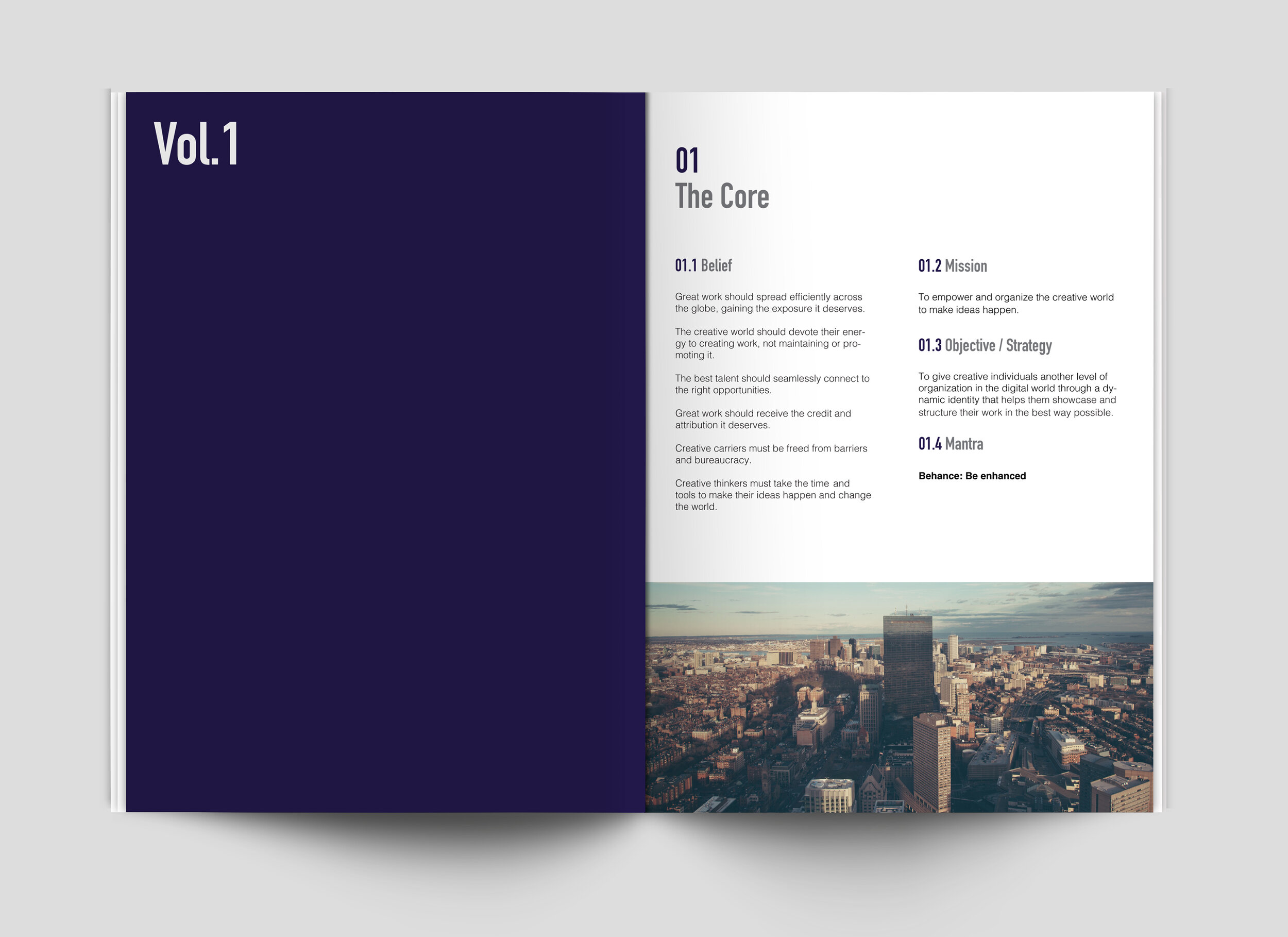
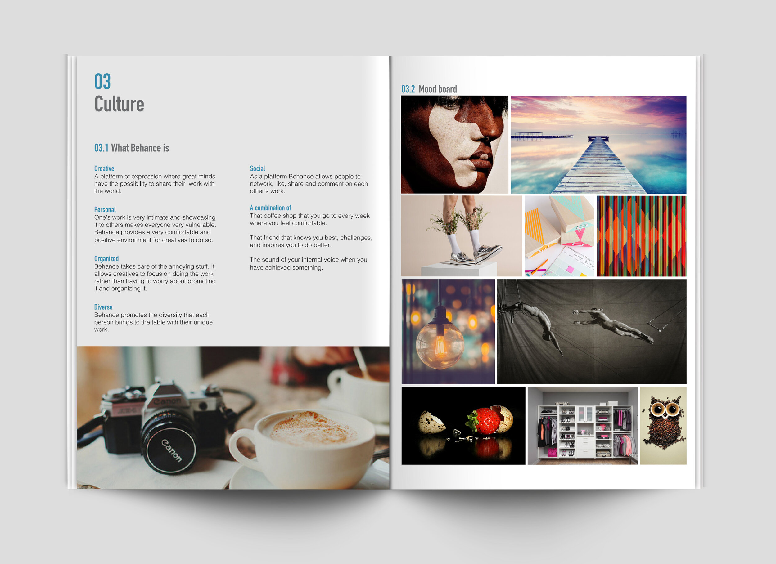
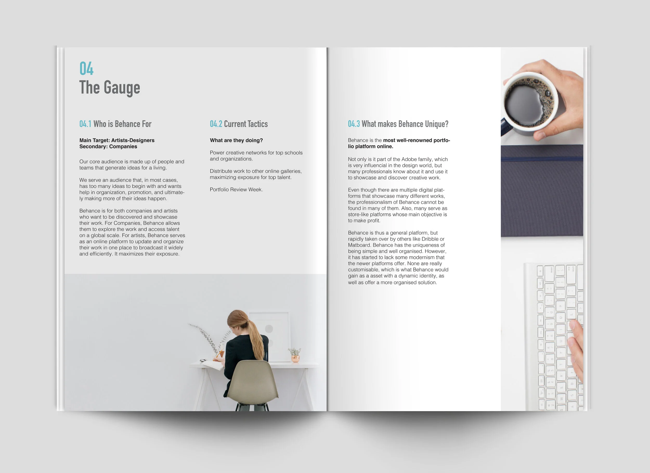
Behance is a platform built for creatives to organize their work. At the brand's core is individual creativity, organization, and diversity.
Problem
Its current image does not reflect the core of the brand, but rather is very monotonous.
Solution
To give creative individuals another level of organization in the digital world through a dynamic identity that showcases individual creativity, organization, and diversity in a more visual way.
Concept and Visual Inspiration
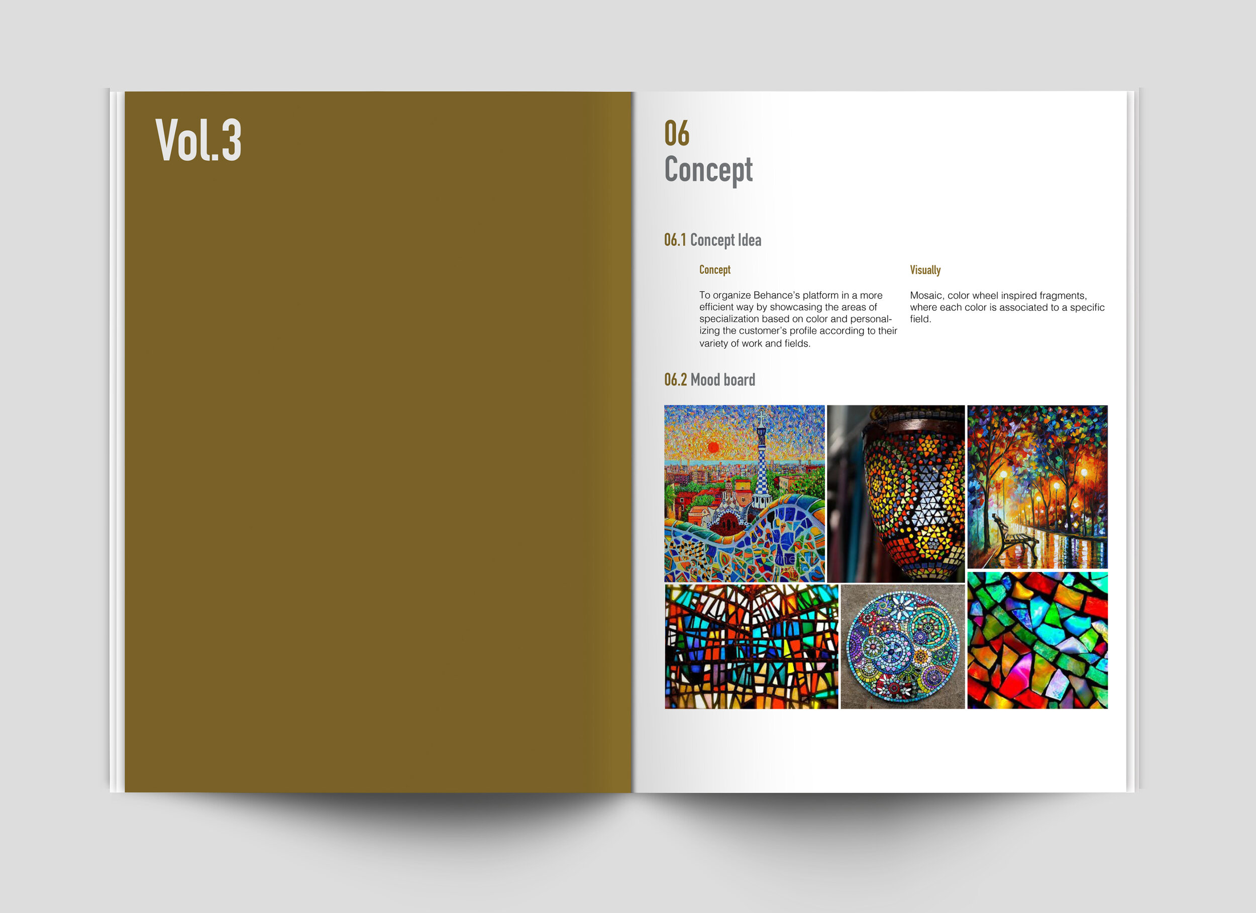
Concept: Organize Behance’s platform in a more efficient way. Showcase the areas of specialization based on color and personalized customer profile according to the person’s variety of work and fields.
The dynamic identity consists of 3 basic elements:

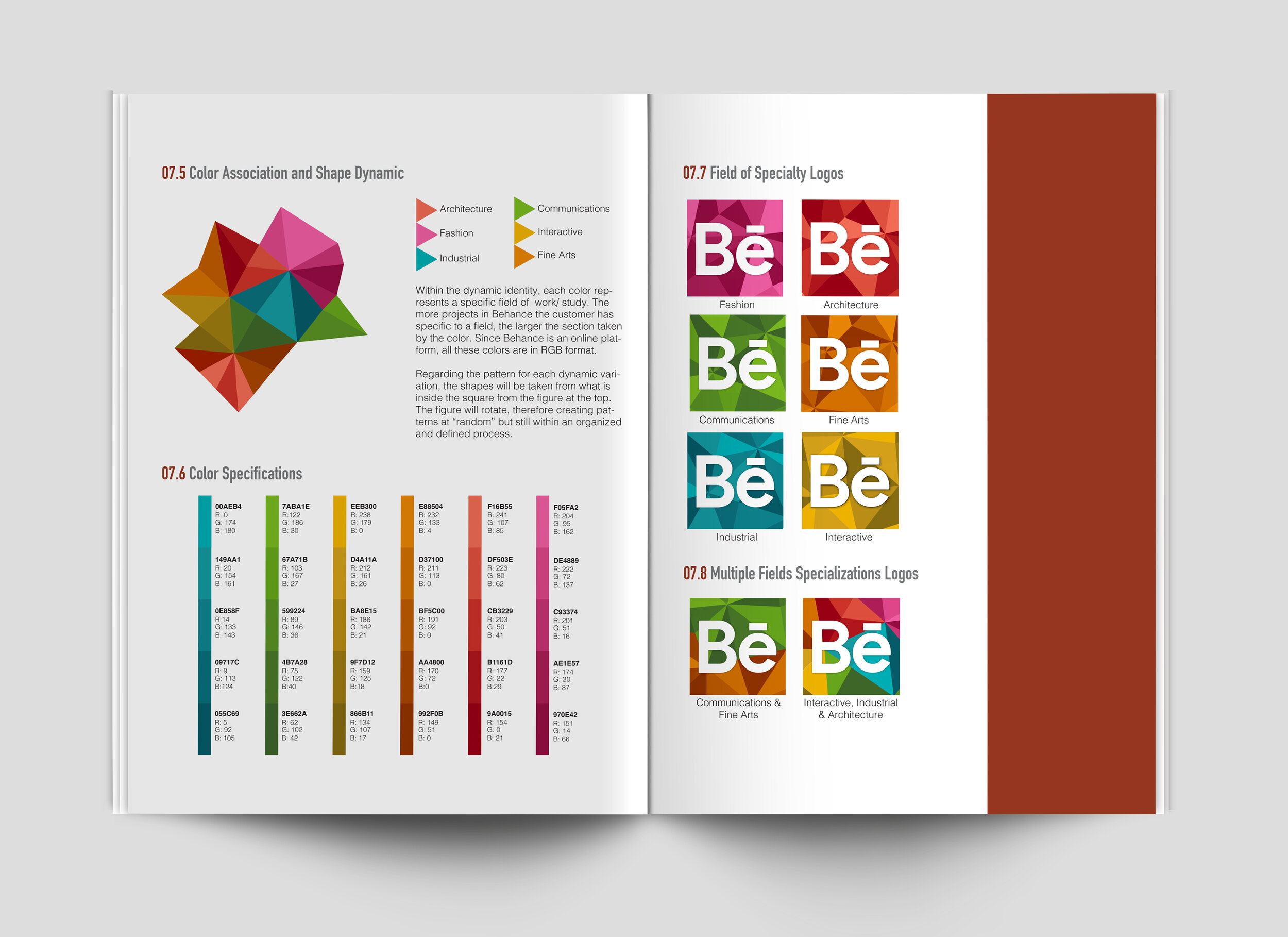
Visually: Mosaic, color wheel inspired fragments, where each color is associated to a specific field
Brand Elements
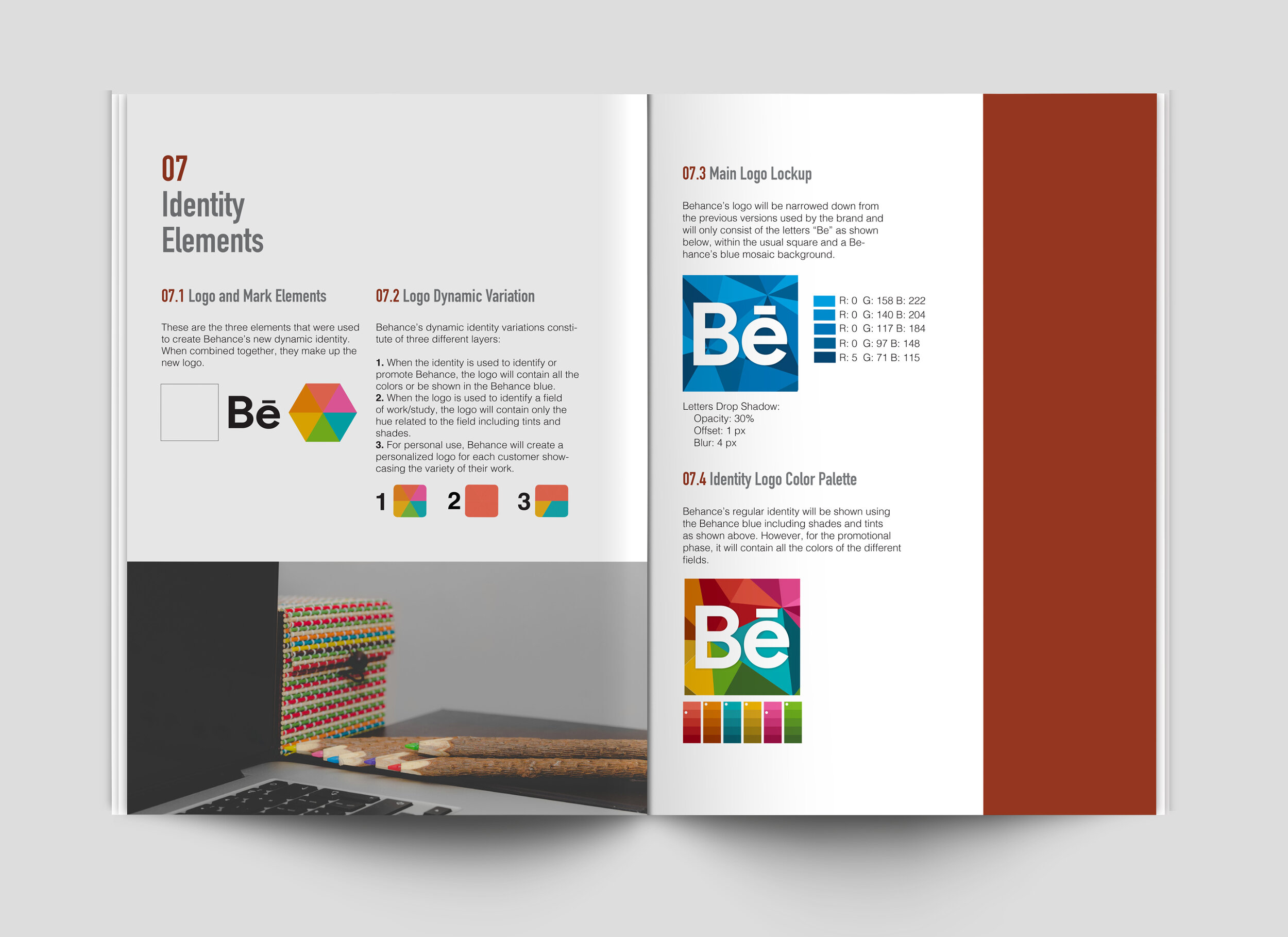
Logo
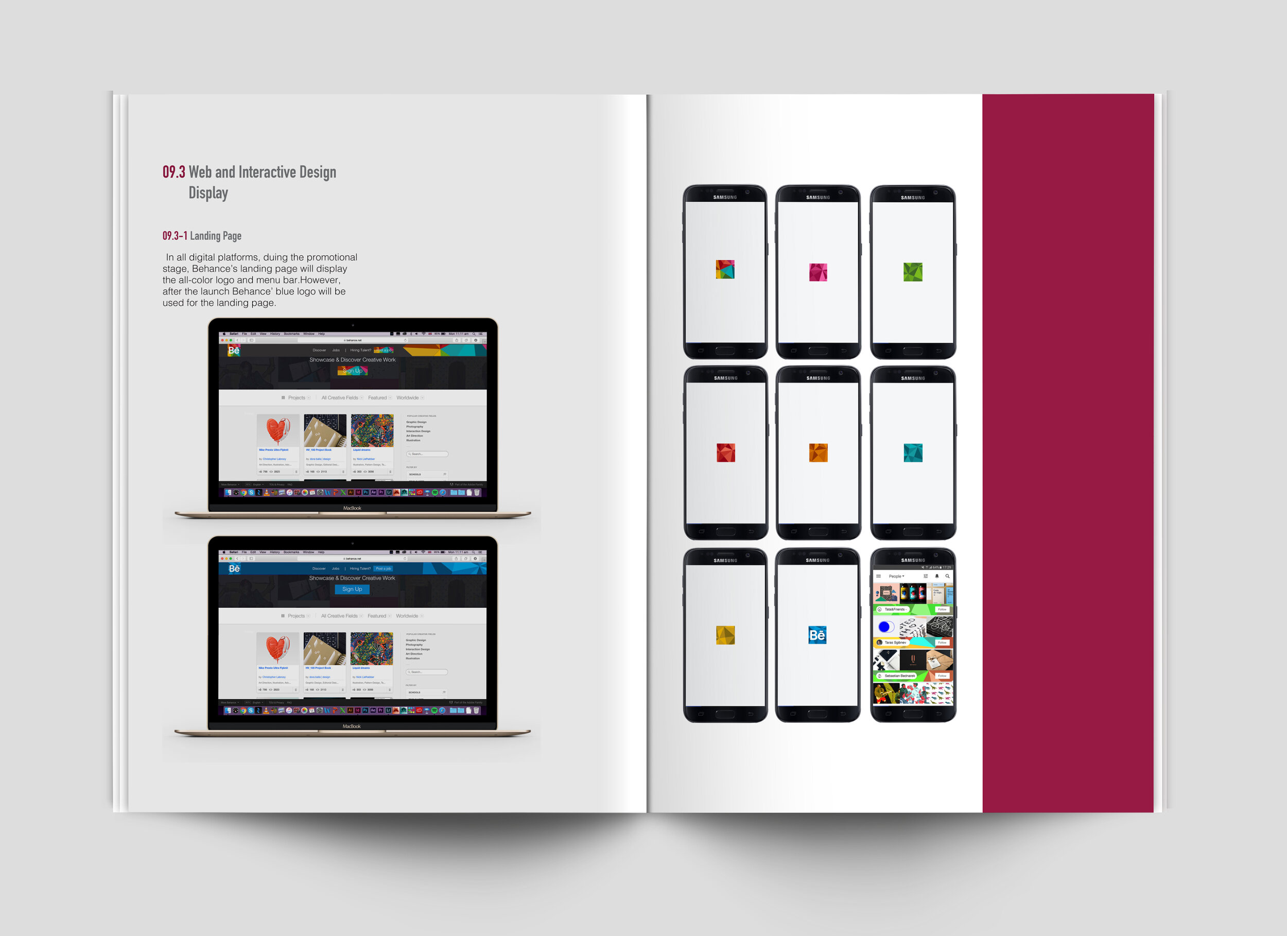
Behance’s logo will be narrowed down from the previous versions used by the brand and will only consist of the letters “Be”, within the usual square and a Behance’s blue mosaic background. However, for the promotional phase, it will contain all the colors of the different fields.

Typography
Product Sans Bold: used for the Behance logo. Gives the brand a more modern and clean look through its geometry.
Helvetica: primary display typeface used by Behance for paragraph form, navigation, and profile within the interface.
Tungsten: primary display typeface used by Behance for the corporate landing page. Mainly used for Headlines and short statements. Tugsten helps differentiate Behance’s landing page to the customer’s interface.
Colors
Within the dynamic identity, each color represents a specific field of work/ study. The more projects in Behance the customer has specific to a field, the larger the section taken by the color.
Pattern: For each dynamic variation the figure will rotate, therefore creating patterns at “random” but still within an organized and defined process.


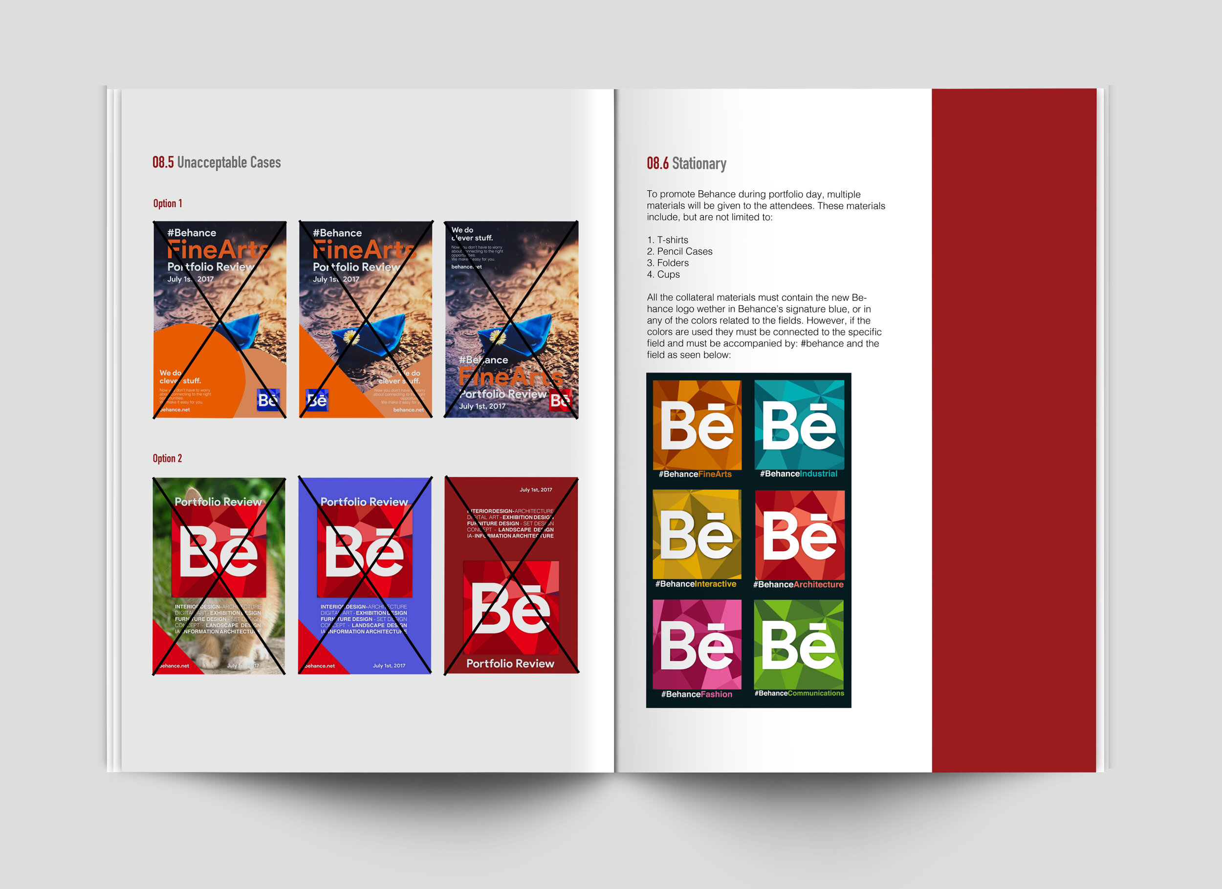
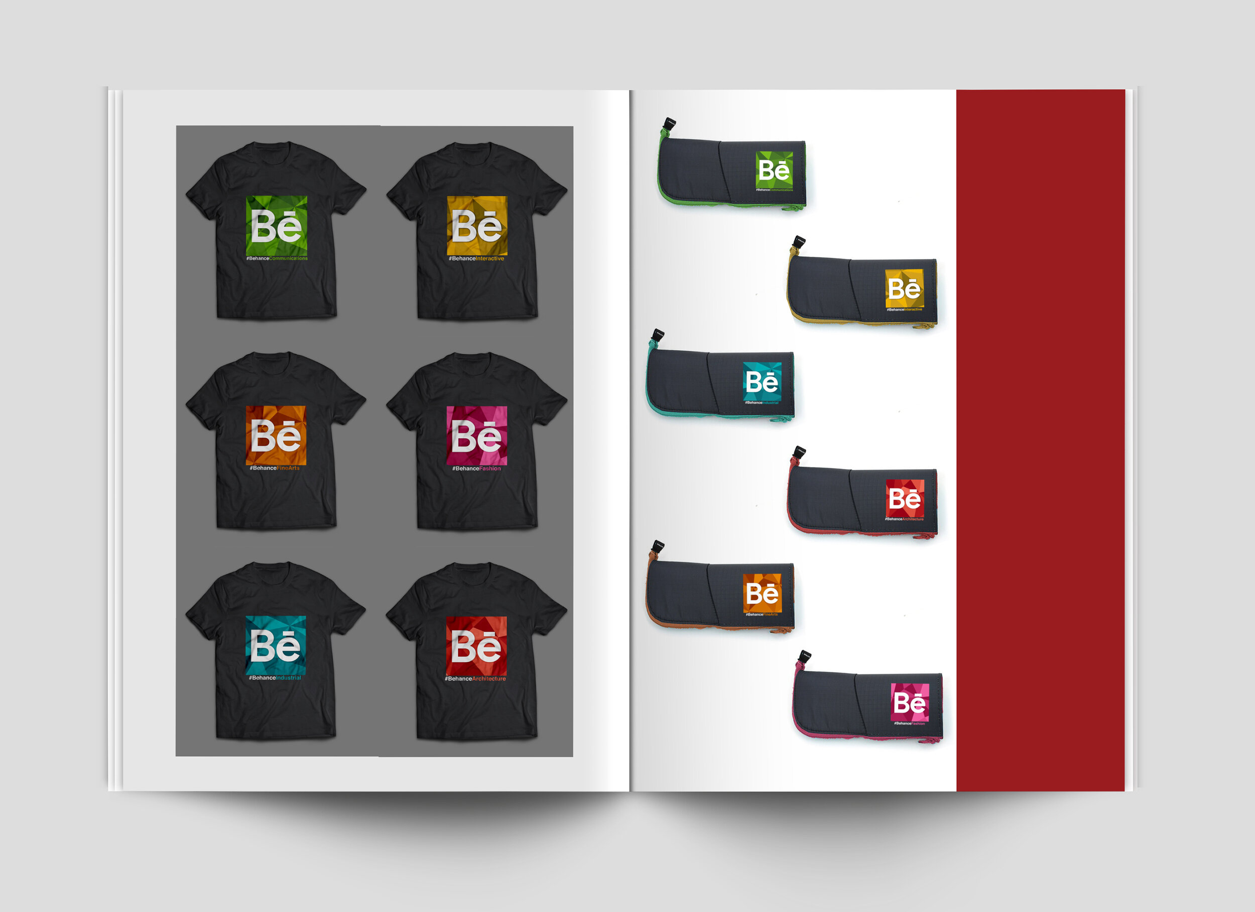
Stationary
During the launch at Global Portfolio Review Week, multiple materials will be given to the attendees. These materials include, but are not limited to: t-shirts, pencil cases, folders and cups. The idea is that the dynamic identity will not only help organize the platform, but also create even tighter communities within Behance.


The Platform
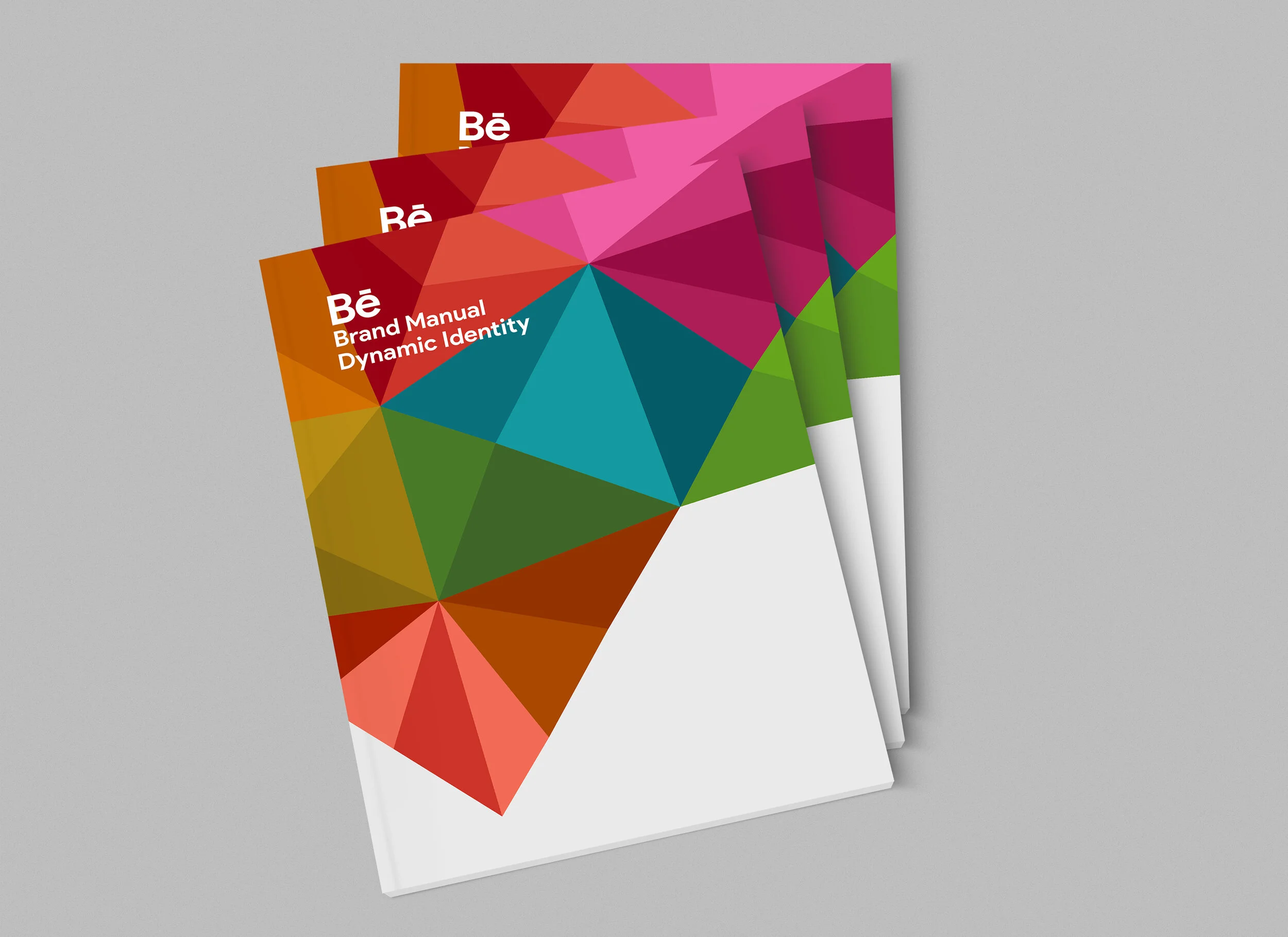


Brand Manual
The Manual dives into the entire process. From research, to rationale and concept, to graphic elements and multimedia immersion.
My Role
Brand Manual Layout Designer
Helped in Design & Ideation process
Research
Mockups
Presentation designer